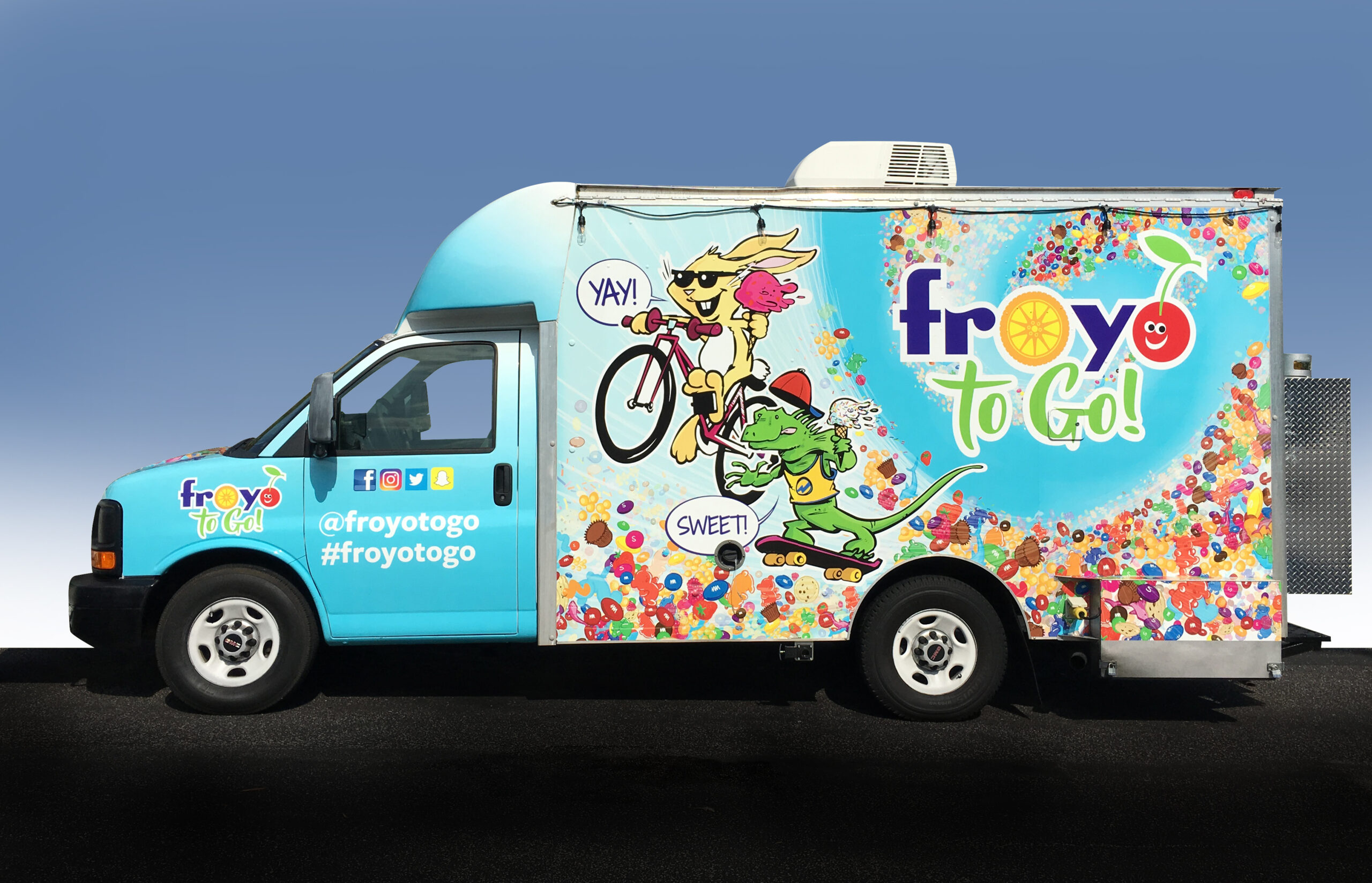
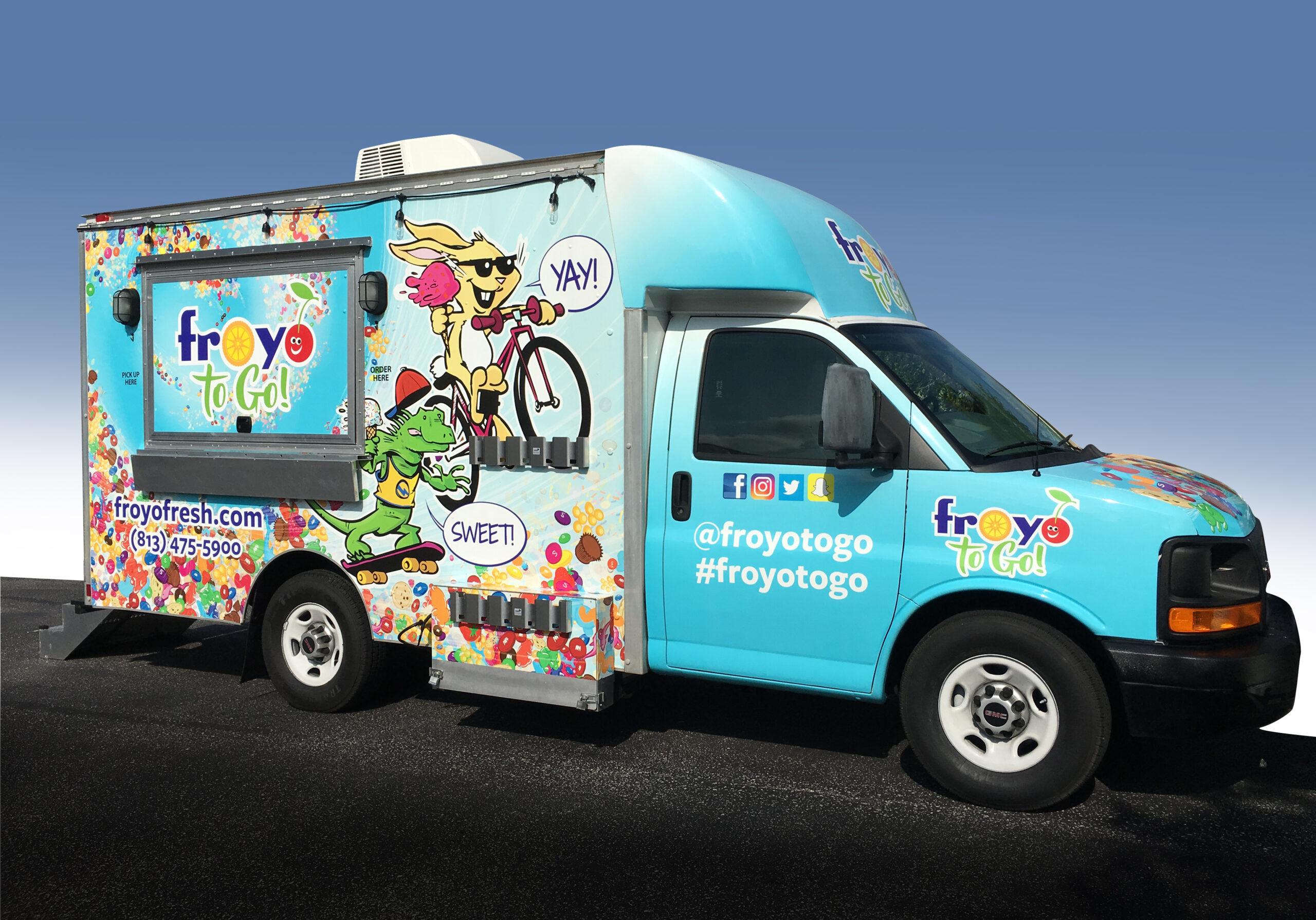
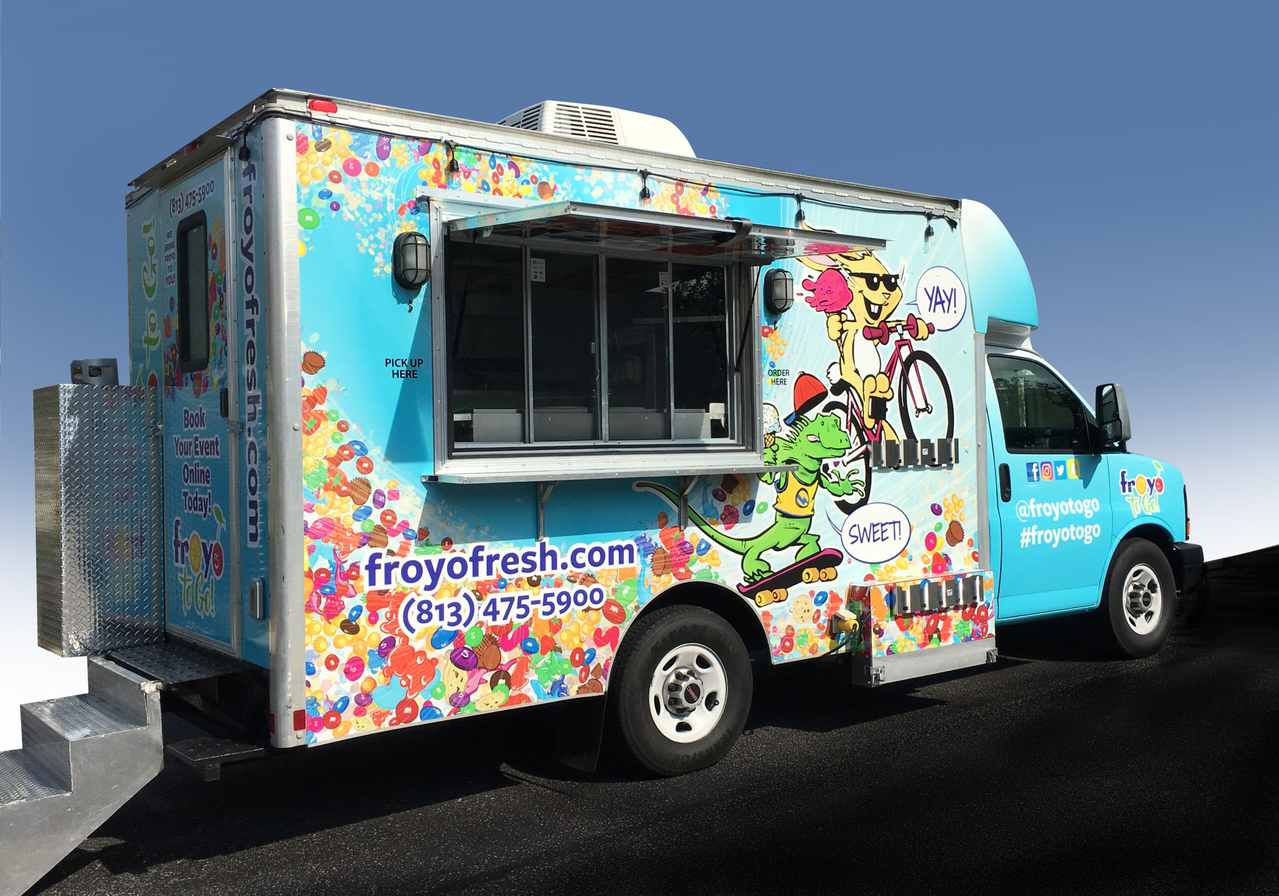
Long-time client Tanya Rubin has been in the ice cream business for decades. Her most recent store, Froyo (established in Tampa, FL in 2010), was so successful that Tanya decided it was time to take her frozen treats on the road. Tanya explained her vision — “I want a food truck that is colorful and fun and has great characters that kids will love.” Netta drew up some very rough sketches to show illustrator Jason Platt what she was thinking. While Jason set up much nicer sketches and dove into the complex image, Netta created a new logo for the mobile business and planned out the configuration of the graphic elements to cover the entire vehicle. There were a lot of revisions along the way to get to the ultimate showstopper vehicle that Tanya, Netta, and Jason knew was dynamic, colorful, and fun enough to fulfill the original directive. The result is a dynamic Froyo-to-Go truck that is in high demand. (Credit to Signs Now in Tampa for producing the vehicle vinyls so seamlessly.)
1. Here’s the finished food truck. Now take a look at its evolution…
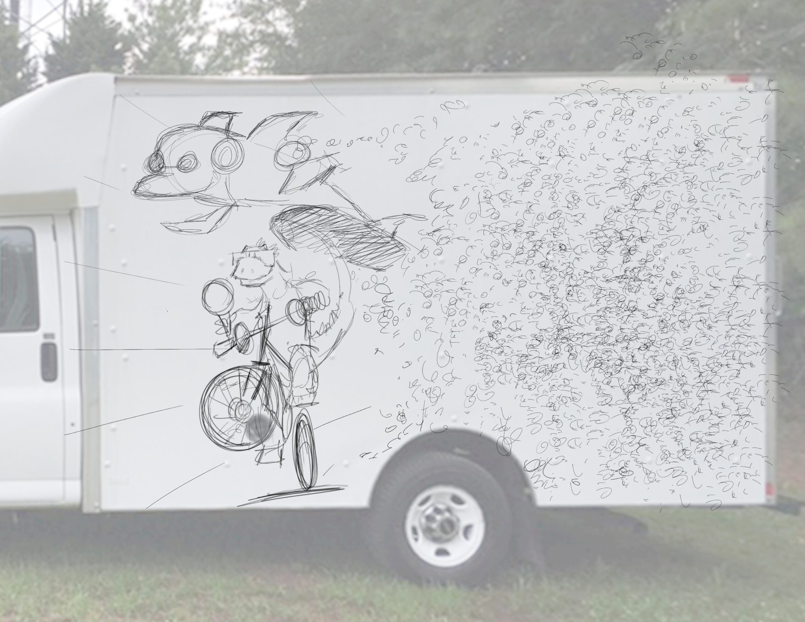
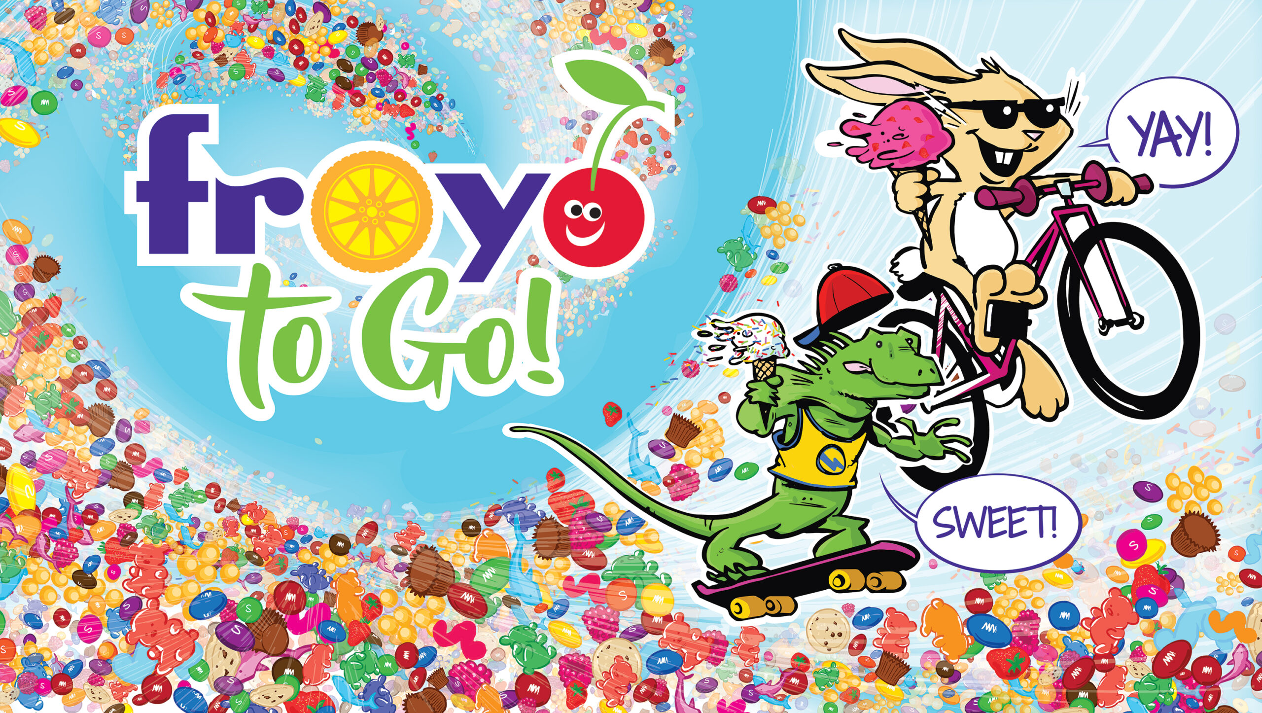
2. We envisioned two characters, a dolphin and a gecko, eating frozen yogurt and ice cream with a trail of candy toppings flowing behind them. Illustrator Jason Platt set up this first pencil sketch/comp, which made us realize that dolphins aren’t very good skateboarders. So, back to the drawing board we went.
3. Changing the dolphin to a bunny gave us a much more dynamic character to work with. We scooted the gecko into skateboard position, and changed the trail of candy into a vortex. We wanted the characters to be flying through the sky on a maelstrom trail of candy.
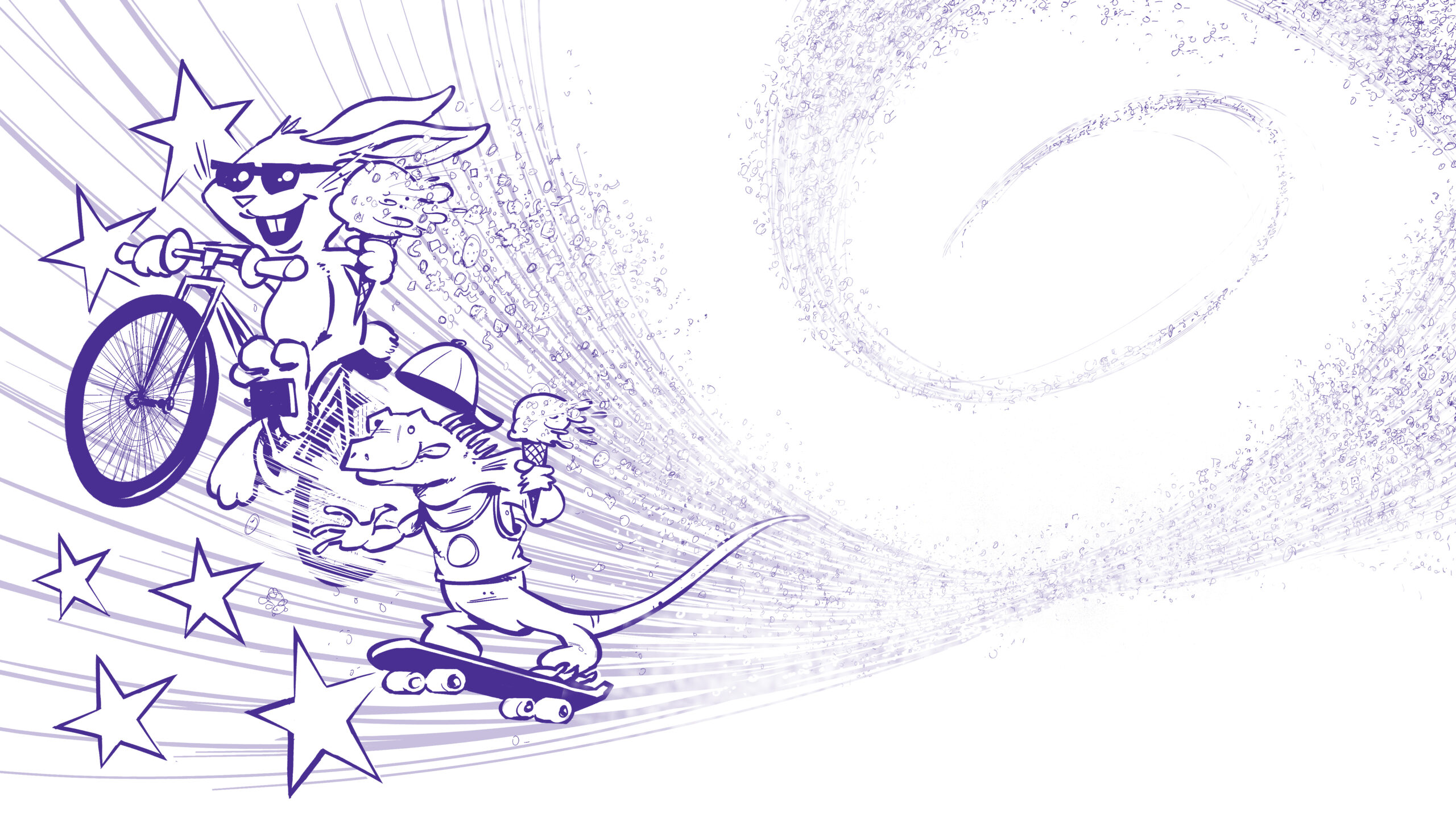
4. With the characters positioned, Jason inked the pencil drawing with purple instead of black. We felt that the purple would pick up nicely on one of the Froyo corporate colors.
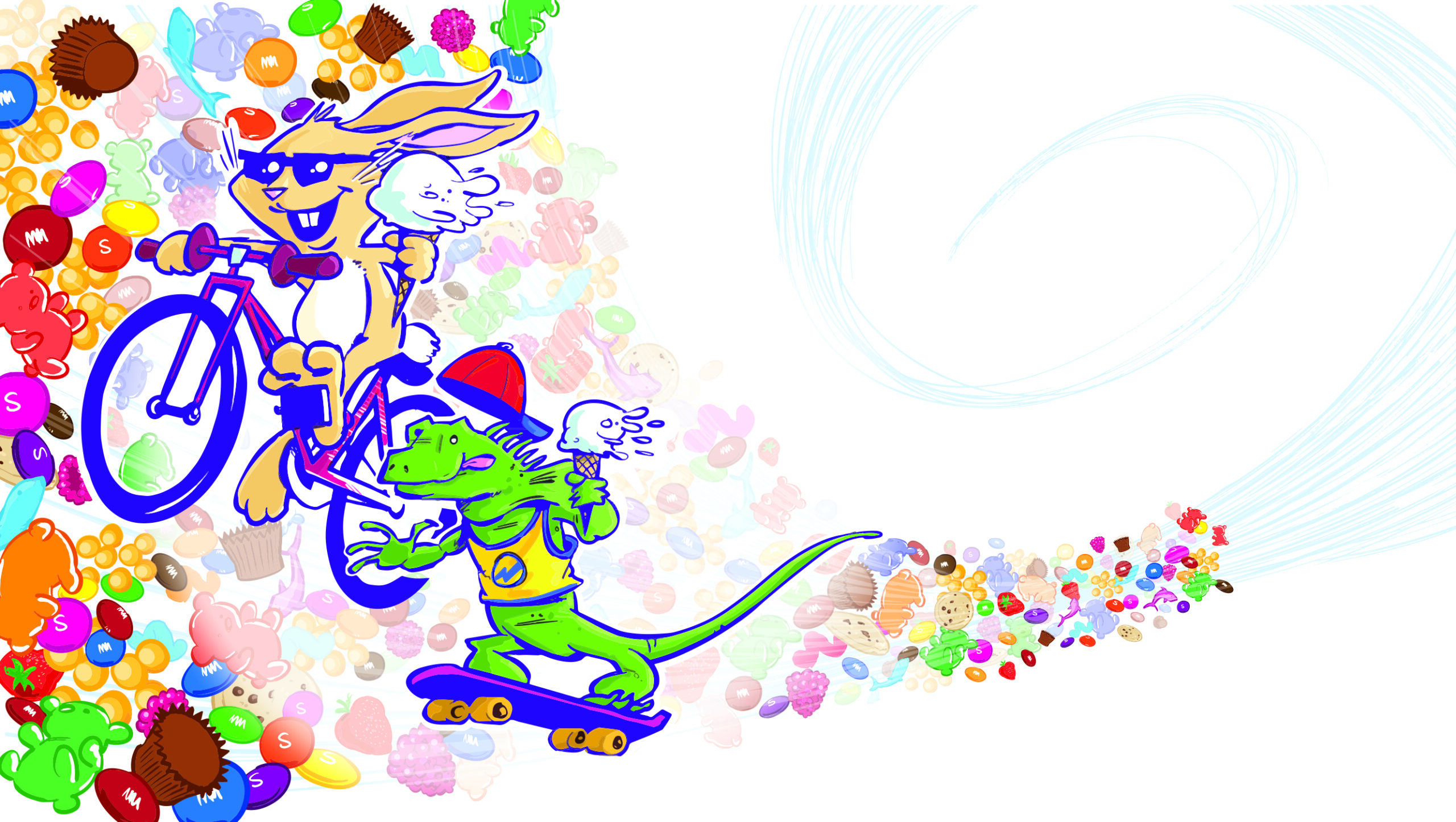
5. Time to add in some color and candy. This was going to be a massively detailed image because, when the candies are seen on the side of a truck, they need to be recognizable candy items.
6. Jason loaded up the image with Skittles®, Gummy bears and worms, peanut butter cups, and berries. We removed the stars. He later added a zillion sprinkles into the image and changed the flavors of the cones. We started out with a lot of candy around the characters’ heads but realized they were going to get lost in the candy storm. We needed to tone it down.
8. It was finally time to place the graphics on the schematic and hope that the actual truck would arrive from Georgia (where it was being retrofitted for various freezer equipment, generators, etc.) looking and measuring like what we’d anticipated. Graphics changed on the back of the truck as we realized that the actual door was different than the truck manufacturer’s schematic showed. We set up graphics and info for the hood, sides, back, and cab to make the truck visually compelling from every angle.
9. Our team effort produced a truck that is fun and attention-grabbing — which was our directive from the start. Kids go wild when they see it!
Keep an eye out for Froyo to Go in the Tampa Bay area! Check out www.froyofresh.com.